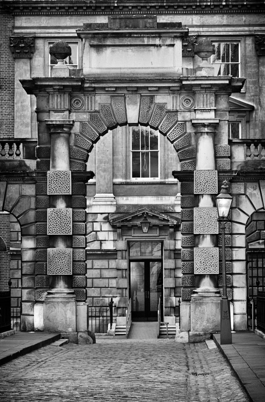
Thanks, I agree, B&W it’s the stronger version. And yet, there’s something about the almost monochromatic original colors that I find very beautiful and pleasing to the eye.
You know I am a black and white enthusiast. But this time I have to vote for color. #1 is flat, sort of 2d and my eyes are “walking” through the frame. I think a vignette would be helpful to direct the eyes to a target. #2 isn’t really colorful, it’s monochrome. But the golden light of the door directly creates attention. And the other lights also lead to the door. It has more depth and is somewhat 3d. I like #1, but looking at #2 made the decision easy for me! This is the vote from the Ammerland studio in Germany. Smiles. Reinhold
Excellent observations, as always, Reinhold! I, too, keep being drawn to the “color” version and I think your point about the 3d versus 2d aspect is spot on. I’ll see what the B & W looks like with a vignette. It’s funny that among my Facebook friends, the “color” (original) version was the favorite, while among fellow bloggers it’s been the opposite.
Love the tones and textures of the b&w but my eyes aren’t really sure what they’re looking for. The coloured one is slightly less busy I think so I’m inclined to vote for that one. Tough one though. Great post. One love 🙂


Lovely pictures.
Definitely B&W, we concentrate on the wonderful array of shapes, patterns and lines, Angela!
Thanks, I agree, B&W it’s the stronger version. And yet, there’s something about the almost monochromatic original colors that I find very beautiful and pleasing to the eye.
Yes, but not for this image, I feel?
B&W
Color!
Thanks for your vote! 🙂
Gorgeous shot, so many layers of texture and shapes. Another vote for the B&W version here.
Thanks, Norm. It’s a beautiful building. And it seems B&W is the winner!
You know I am a black and white enthusiast. But this time I have to vote for color. #1 is flat, sort of 2d and my eyes are “walking” through the frame. I think a vignette would be helpful to direct the eyes to a target. #2 isn’t really colorful, it’s monochrome. But the golden light of the door directly creates attention. And the other lights also lead to the door. It has more depth and is somewhat 3d. I like #1, but looking at #2 made the decision easy for me! This is the vote from the Ammerland studio in Germany. Smiles. Reinhold
Excellent observations, as always, Reinhold! I, too, keep being drawn to the “color” version and I think your point about the 3d versus 2d aspect is spot on. I’ll see what the B & W looks like with a vignette. It’s funny that among my Facebook friends, the “color” (original) version was the favorite, while among fellow bloggers it’s been the opposite.
b/w
Love the tones and textures of the b&w but my eyes aren’t really sure what they’re looking for. The coloured one is slightly less busy I think so I’m inclined to vote for that one. Tough one though. Great post. One love 🙂
You see why I couldn’t quite make up my mind! Thanks for visiting and voting! 🙂
B&w 🙂